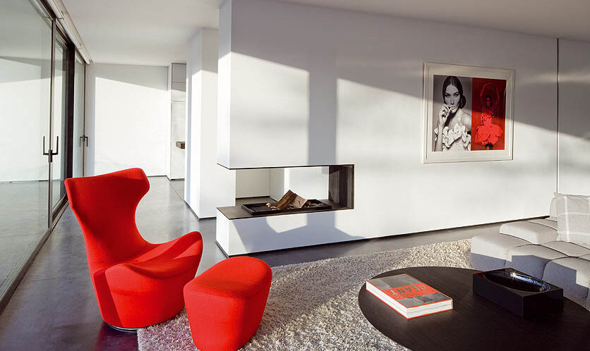
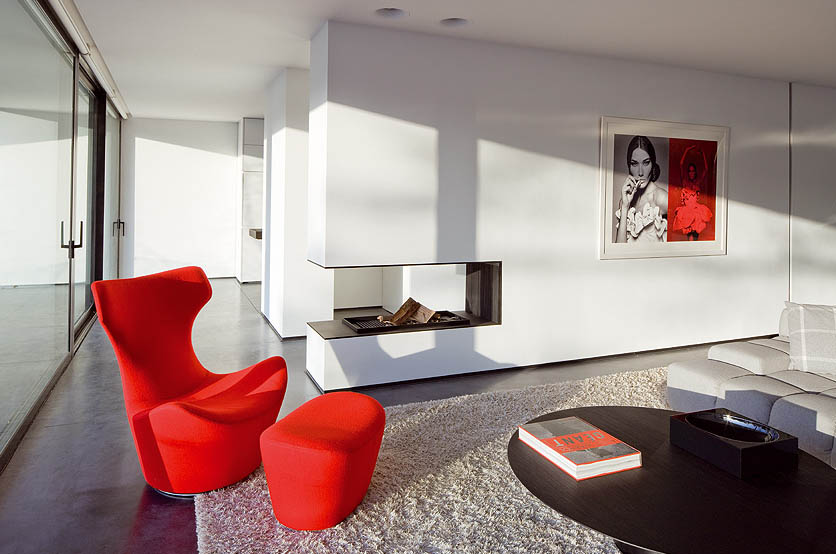
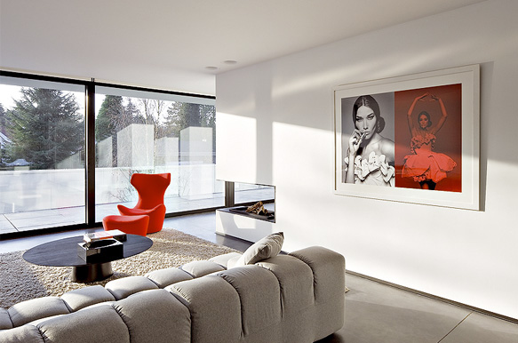
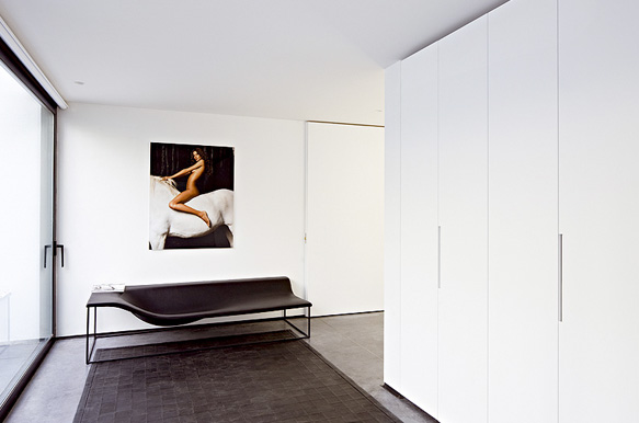
Design so beautiful one simply has to stare. The Belgium based Erpicum Architects and designers have delivered. This space has lines so refined and defined it is almost rude in it’s perfection. It is of course the simplicity of spatial placement and the heart breaking accessories that pulls it all together and makes it work.
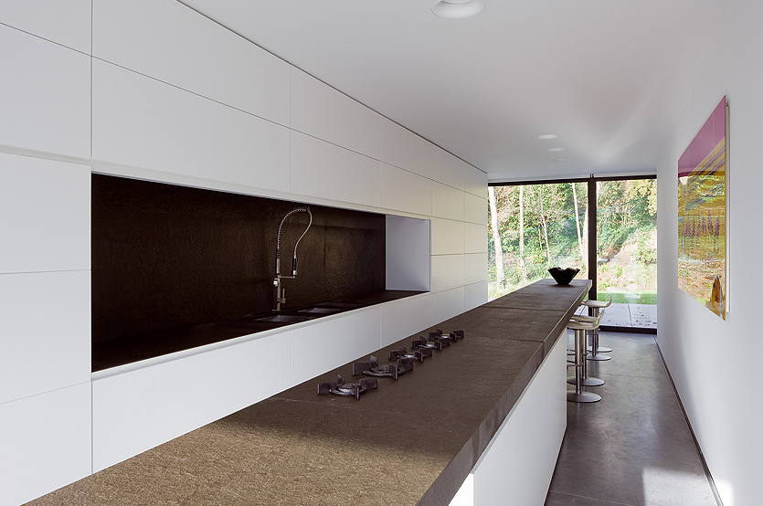
It is this ardent simplicity that enables you to notice all the stylish embellishments. The red color socks you in the eye because the surrounding space is pure white. The beautiful elongated galley kitchen serves up zero unnecessary clunky distractions with handle-less, discreet storage. Maximalists will scream! Minimalists will cream!
The wall-break fireplace is a friggin’ joke it’s so delicious.
Whilst the place bathes in creams and whites broken up with red as mentioned, it also serves up brown hues from furniture and counter tops. It works. It just works.
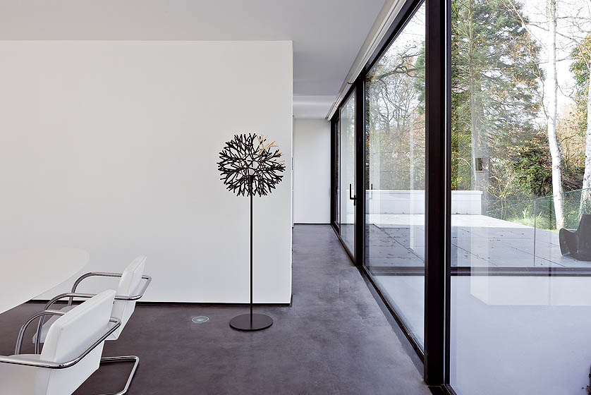
The crazy sloped and slanted bookshelf is the resident room rebel, but the Barcelona chairs are not having it and bring things back to a degree of order.
The interior tree at the bottom works because its fellow stylish furnishings allow it the space to breathe. The rest of the Erpicum portfolio will show you inspired spatial awareness and how to rock it.
This is haute minimalist design of the highest order. My friend, you have been schooled.

“To endorse emotion” – Bruno Erpicum.
[pinit]
_______________________________________________________________________________________________________
Source:
See more @ Erpicum
Principal architect:
Images:
Erpicum are based in Belgium but design worldwide.
NOTE: Featured items in posts or on galleries may not always still be available at their original linked sources after an Event.
