Inspire Notes:
This Australian home deliciously refuses to follow any standard architecture. With it’s predominance of block black and block cream, interspersed with ethnicalia, it does rustic-chic to a tee.
The wooden steps amongst the marble seems almost like a structural after thought – but one which suits the design lawlessness of the space.

The art here is simple and abstract and matches the spirit of the place.

This home is fairly rug-less. With this kind of simple set up, that tends to be the norm with designers, stylists or home owners opting for naked marble, tiled or wooden floors.
When they do go for a rug or two, they stay in tune with their design and accessory choices by opting for a really simple flat woven rug as seen in the kitchen above.

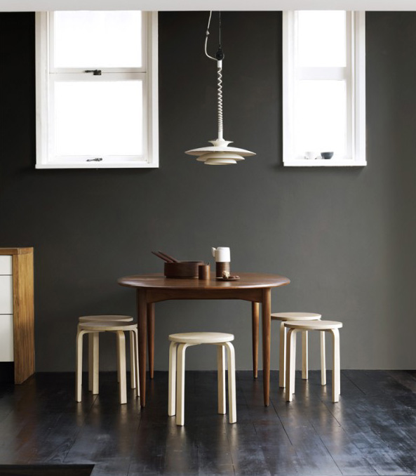
Mz Prue Ruscoe delivers a divine set piece with this shot. The synthesis of colour has sweet chocolate written all over it with the kitchen skin deciding that it would opt for charcoal against the grain of the rest of the property.
The Louis Paulsen lamp with the chocolate table and the Frosta stools are fabulous here.

The home accessories are in perfect agreement with the home. Rustic wooden bowls meet the Marimekko in Good Company teapot meet an ethnic etching.

________________________________________________________________________________________________________________________

This home is calm and lovely. Cream and white accessories, cream and white skin and cream and white furniture, with deliberate blocks of black and plenty of wood.
It shares the refined repose of this home. To try this home style you would be heading to vintage or flea markets to pick up some cool one-off character pieces; a great sculpture, a statement picture or a look-at-me ornament. For character go for handmade, artisanal pieces rather than easy pick ups from the larger stores.
Stage your space with careful, consideration. The accessories in this space are quite sufficient. Any more and it becomes a bit of a caricature of a ‘hippy’ home, any less and it veers into tumbleweed territory, i.e too bare.
Not everyone has access to soaring ceiling heights, but it is also the generous lighting that makes this space so fresh and peaceful. You can see here that the huge windows are butt naked.
Think about releasing the light flow into your space by decluttering and choosing the right blend of curtains, blinds and lighting if you’re too shy or too exposed (location-wise) to go bare.
________________________________________________________________________________________________________________________
- Photographer:
Amazing staging and placement by Prue Ruscoe
Source:
NOTE: Featured items in posts or on galleries may not always still be available at their original linked sources after an Event.
