Inspire Notes:
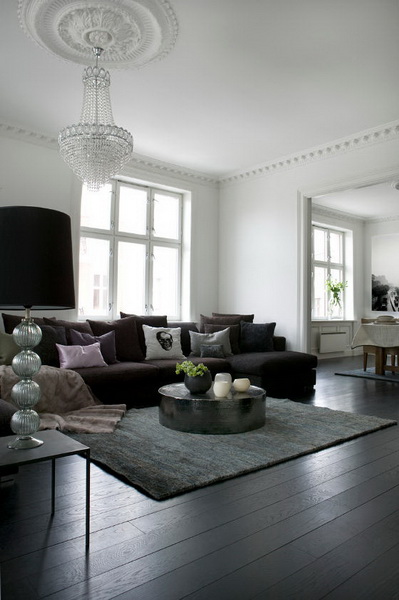
This space by Wench Holth is almost painfully beautiful. It reminds me of halcyon days spent in Scandinavia and indeed it is fairly typical of a home there.
Gosh, where does one start? The floor? Mon Dieu! Just beauteous. Natural wood stained black to contrast and anchor the crisp white walls. The exuberant basket chandelier works because there is enough height and width here. The chilled, calm space below it prevents it from looking overblown and pompous.


There is so much communication and follow-through with the accessories, fixtures and fittings. The sleek doors, the occasional tables dotted here and there, the floor of course, the emotive artwork and even the skull cushion. Everything agreed upfront to show up in handsome black.

Corian moulded kitchens always sing simplicity! Ease! Relax! – We don’t want no trouble here! They beg you not to clutter them with meaningless oddities and gadgets you will only ever use once. So the gorgeous oversize glass blown plant pot is left to guard the serenity and easy clean surfaces.
Perhaps Ms Holth just snuck it in there for the photoshoot but it is spot on for that corner of the room.
The white Deena side table is something isn’t it? It does look rather staged, homeless and stuck out there front of pic, but it shows you more communication and follow-through between it’s funky little self and the white kitchen counter top.

La la la la….I’m just singing with homestylin‘ joy!…Give me a minute…la la! This restful passageway is criminally beautiful. Simple to the core.
It is supposed to be a mere thoroughfare and yet one would want to just sit and drink in the serenity and calm the designer has created.
All the cuts are simple. The side tables, the Hans Wegner-esque chair, the lovely sepia painting (whose colour is communicating – whispering…ever so subtly with the rug – do you see it?). The architectural lines are precise and perfect. The clarity and attention to detail is inspiring.

________________________________________________________________________________________________________________________

This is a city apartment, but when I look at it I get none of the chaos that might sneak in through the front door from a typical city.
This space oozes sophisticated calm and articulate style. Here’s some pointers if you wish to create something similar.
The skin is crisp white anchored by that awesome black floor. The doors play a leading role in creating the feel although they stand there silently pretending to be unimportant.
Doors can really define your home style and should not be neglected in the rush for the more obvious fixtures and fittings. These rich wood doors are exquisite choices for this space. They are solid Victorian style 3 panel oak doors with a tasteful and gorgeous black veneer.
You will notice that the ornate ceiling medallion holding the chandelier and the cornice moulding bordering the living room do not travel to the other rooms.
I like that. It sets a style tone but the clean finish of the other rooms allows for a more fresh contemporary balance. The fuss and ornate pretty much stops there.
Most every other choice in this apartment is clean lined. The kitchen, the tables and the frameless canvases. The cushions and the bedding are muted browns, purples, blue, creams and whites.
A nice melee that looks hand woven and artisanal, not generic and mass produced. So again there is a balance created that is typical of a Scandinavian home i.e the lines may be clean and modern but they always introduce something rustic, something artisanal or raw and handmade. Something down to earth somewhere.
________________________________________________________________________________________________________________________
Gushing admiration, interior mouth dribble and thanks to:
Photo Styling:
Interior designer:
NOTE: Featured items in posts or on galleries may not always still be available at their original linked sources after an Event.
